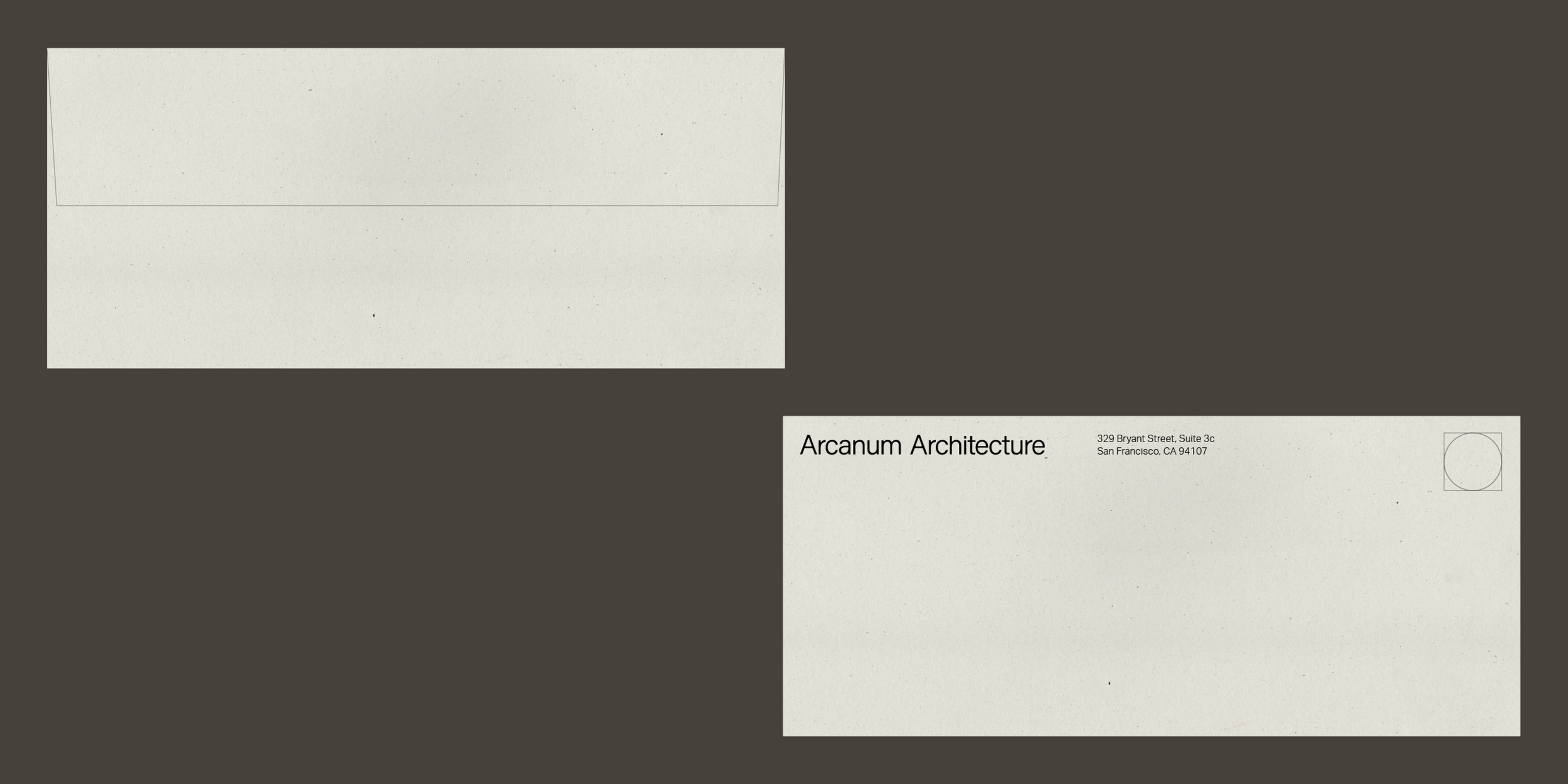
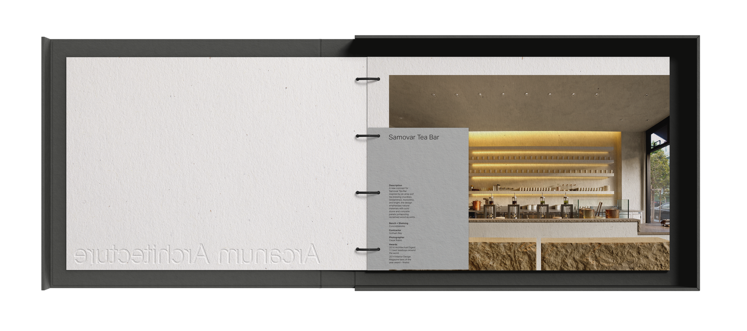
Arcanum Architecture
One of San Francisco’s premier architecture firms approached Hybrid-Design wanting a brand refresh to better reflect their work. A simple stripped down look reflects the studios approach to design. The wordmark is built around the keystone of the “A” creating unique angles found in Arcanum’s work. An emphasis on tactile print material rather than color creates a simple yet rich palette for the brand to exist on.
Done with the team at Hybrid-Design